In case you didn’t know , Google+ got a massive face lift today. ( yes, you are right, there is no reason you should have known this. )
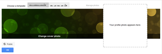
Though some of the designs borrow from Facebook ( did I actually write about how social networks should differentiate? I don’t know what I was on when I said that. All social networks should just copy each other ruthlessly, that’s what the tech industry is about ), they have also introduced some innovative new features. One of them is the brand new ‘cover photo’. It basically lets you a put a large, and ridiculously narrow pic on your profile.
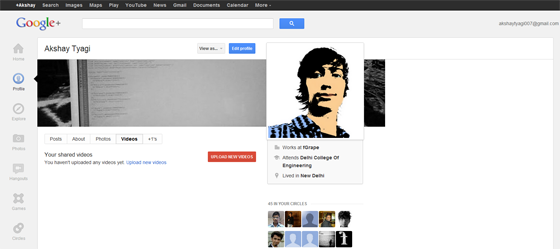
Why didn’t Facebook think of this before Google. Now it’s evident that Google+ usage is going to sky-rocket. Just take a look at how awesome my profile looks with the cover photo.
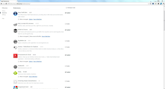
OK, apart from this, Google has actually made some intelligent design changes, like shifting the navigation bar to the left, which is a smart choice for full screen layouts, as screen sizes get wider and wider. Navigating from a sidebar is by design, much easier. The navigation items have large icons, accompanied by text. You can also rearrange the items in the navigation bar. Facebook also lets you rearrange you items in the bookmark sidebar, but it does not support drag and drop. What is striking here is that the Chrome browser ( beta release cycle ) has also received a similar facelift, that makes the settings UI much more slick.
And I can’t help but think that the recent acquisition of the OINK team, including Digg’s founder Kevin Rose, are behind these UI changes. After all OINK was known for the awesome design of their app.
What are your thought on the Google+ redesign. Will this make a difference?


Leave a Reply